So Marvel’s Secret Empire event chugs along, amidst what is–based on my Twitter timeline, anyway–a shocking lack of the internet pearl-clutching that they’re clearly trying to create
You might recall that my previous comments on this event have included such searing insight as “Well, it’s kinda dull but really not that big of a deal” and “It’s all kinda familiar, isn’t it,” but until these two issues I would’ve characterized it as a competent if uninspiring superhero event. Now…well, it’s still uninspiring, I guess.
There are, to me, three major problems with the series as it winds through its second issue and its Free Comic Book Day episode, which I’ll enumerate after the jump. Fair warning, though–this one includes pretty direct SPOILERS for events in those issues, especially issue #2, including screenshots of theoretically exciting moments.
But those come a little later.
Problem #1: It takes itself SO seriously. Both of these issues feature a narration that seems to be striving for epic, or for … I dunno, momentous or something. It’s a first-person unknown narrator (I think, unless I’m missing who it’s supposed to be) yapping on endlessly about just how DRAMATIC the events of the series are. A randomly selected example: “We found ourselves divided–and under siege. So many threats, so many dangers–but the one that would end us–was the one we trusted most.”
When I was writing about issue #0, I compared this particular Captain America storyline to the “replacement Cap” story from the eighties. But one of the reasons that story didn’t get too heavy, in the end–despite some classic eighties-style violence being done to and by the replacement Cap–is because it culminated in Steve Rogers having a fistfight with President Ronald Reagan in the White House after Reagan had been turned into a snake-person, while the Red Skull (in Rogers’ cloned body) gloated behind the scenes.
There was a level of goofy, comic-booky fun to the thing, is what I’m saying, and that is TOTALLY absent from Secret Empire. Writer Nick Spencer has shown a love for the more over-the-top Cap stuff in the past–he brought back CapWolf, for God’s sake–so I wonder if this tone is partly a response to the deeply-felt reaction of fans on the internet to the Nazi Cap story.
If so, I think it’s the wrong way to go. It’s not doing anything to help the overall storyline, and it’s making this limited series ponderous and dull.
Problem #2: We’re only just getting to the plot. It’s been four(-ish) issues (you know the number sequence: zero, FCBD, one, two, just like we all learned from Sesame Street) largely of set-up and restatement of the events until now. Only now, in issue #2 (the fourth issue) do we got some kind of specific McGuffin: the heroes have learned about the Cosmic Cube’s role in Cap’s changeover, and some of them are hunting for the Cube fragments. Others just want to kill Cap for betraying the country and/or himself.
That’s all fine–it’s pretty good, actually, providing clear conflicts and goals both internal and external, and giving most of the characters something concrete to do. It just should’ve happened much earlier, to give this formless mass of self-importance some kind of structure and focus.
Problem #3: The art isn’t doing Spencer any favors anymore. The zero issue was drawn by Daniel Acuña, whose work I don’t always personally connect with but who can undeniably tell a story. Issue #1 was Steve McNiven, whose art is probably the current prototype for “glossy, clean, mega-crossover-friendly work”. These two, though are both drawn by Andrea Sorrentino, and while he clearly has a keen eye for design, image, and color, the storytelling is working against the story.
(I’m violating the Gillen McKelvie paradigm here–speaking about the artist independently from the writer and making all sorts of assumptions that I know who is responsible for what on the page. I feel okay with it because Sorrentino’s approach is SO idiosyncratic, and SO different from the other two we’ve seen so far on this same series by this same writer, that it seems easy to extrapolate what is a function of his work. But I did want to at least acknowledge that I was doing that through conscious decision.)
Sorrentino is given to complicated, J.H. Williams-esque layouts, building pages that probably look absolutely stunning as individual pieces hung on walls, but that don’t always suit a straightforward superhero narrative. The climactic battle in the FCBD issue, for example, is done in ever-smaller panels leading up to a full-page splash. It’s a familiar, effective technique for creating the impression of chaos and confusion culminating in a triumphalist hero (or villain) moment.
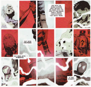 Sorrentino’s last page before the splash is a 25-panel grid. The nine panels making up the bottom middle are actually a single image, a hand picking up Thor’s hammer. The gutters still cross it, to maintain (I’m guessing) the feel of quick cuts and constant action. The surrounding panels are frozen moments from the battle. All well and good.
The panels alternate between a desaturated white palette and a dark red overlay. It appears that the red panels are MOSTLY villain shots, and the white panels are MOSTLY heroes getting taken out, but the alternating red and white continue over the hand picking up the hammer. This is probably to illustrate the dichotomy that exists within the idea of (SPOILER for something that leaked on the internet like two months ago!) NaziCap picking up Mjolnir. But the result is that it pushes the chaotic feeling of the small panels just a NOTCH too far–like trying to butter toast via strobe light–and turns the whole page into a gorgeous, carefully designed burst of static and noise that–to my brain wiring, at least–is really difficult to read.
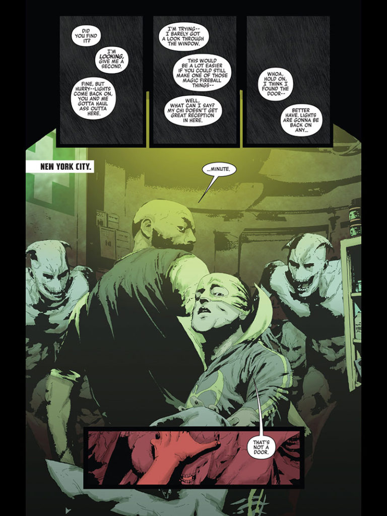
There’s also repeated problems with structuring the page to draw the eye to the correct spot, or to best serve story beats. On the page below, for example, the goal appears to be to have three black panels of our heroes fumbling around in the dark; when the lights go on they are startled to be surrounded by baddies–and I assume we’re supposed to be startled too. But the way this page is laid out, literally the first thing the eye falls on (my eye, at least) is the ghoul off to the right, leaping bright white off the muddy background. (The speech bubbles floating in the black at the top look like the could be coming from the main scene, and so don’t pull me in.) From there I naturally follow the demon-thing’s eyeline to (a weirdly off-model) Iron Fist, and only then do I realize where the page was supposed to start, with the startle moment already rendered pointless.
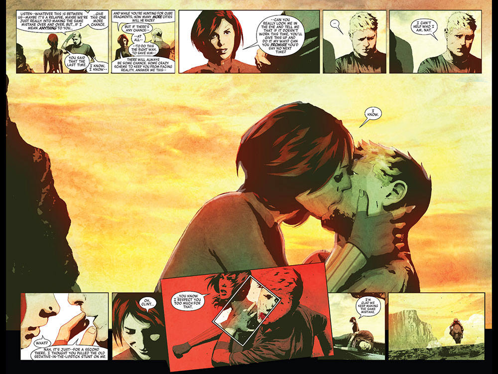
The absolutely gorgeous double-page spread below has a very similar problem. The way it’s meant to be read, obviously, is the tense conversation across the top leading to the climactic kiss; then the fakeout reversal in immediate response, and–surprise!–the double-fakeout sucker punch. It’s a nice little action rom-com scene, but for it to land we need to travel the beats of the story along with them.
The way my eye tracks this page is that the first thing you see is that kiss, gorgeously drawn, up against a sky-on-fire sunset. But then, thanks to the bright red color and the way the panel overlays, the very next thing my eye is drawn to–every time!–is the panel of the punch. (And the inset white panel further draws the eye directly to the impact, just to make SURE you see it.) This undermines the fakeout for sure–by the time you see that you know how it’s going to end–but (again, for the wiring of my brain, at least) it undermines the entire structure of the page. I’ve seen the two major action beats before I even get to the initial conversation, and what could’ve been a fun scene is rendered inert.
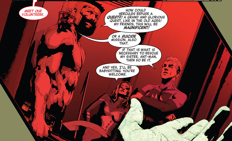
Sometimes it’s an even simpler problem, one that Spencer probably could’ve solved in the lettering phase. For example, the panel below: Given the red wash over everything (for no story reason I can see) and the completely non-descript line of dialogue–I had no idea who the lady superhero was, and had to go to the roster in the front of the book to figure it out.
(It’s Mockingbird. DUH.)
Or here–based on the panel breaks and the narration and everything being steeped in shadows and the incredibly bold presentation of the BLAM!–it feels as though something intensely dramatic is occurring. In fact, it’s just Black Widow shooting into the air to get people’s attention. (I think. I’m honestly not completely sure.)
On another, more impressionistic book, I would LOVE Sorrentino’s art and style. It is gorgeous and striking and interesting. Heck, he might be fine on a mainstream action story if it was a book that I had a ton of good will towards, where I was willing to overlook the occasional speedbump.
Secret Empire, with everything else it’s got working against it…well, it just isn’t that book.



Spencer is such an uneven writer. Superior Foes and The Fix are so funny and charming and light on their toes, while Morning Glories and most of his other Marvel work are such dreary convoluted slogs. Is Steve Lieber the magic ingredient? Ant-Man is decently entertaining (and occasionally very funny) and Lieber-free, so maybe not.
Love Sorrentino’s art as a general rule, but it’s like he’s missing the entire point of the page-turn reveal. And he’s using interesting narrative tricks, but using them incorrectly.
Lieber made a comic about spelunking fun and engaging! I don’t think Superior Foes would have been fun at aaaaall with another artist
Graeme pointed out the problem’s with Sorrentino’s storytelling in a recent podcast. I liked how you made the same point, Matt, but using pages from the comic. It really demonstrates that there is more to successful sequential comic book art than stylised pretty pictures. Storytelling is the first benchmark to measure comic book art by and as you demonstrated, Sorrentino’s work here does not measure up.
I thought Black Widow had executed the guy in the second panel when I first read the book, so I’m glad I’m not the only one struggling!
I read it as, panel 1: Black Widow sneaks up behind a guy, panel 2: guy notices her, panel 3: “BLAM!”, panel 4: those dudes be all like “huh?”
Sorrentino is done soon, no? I agree with your analysis, though. There are some interesting pages, particularly in issue one. I would argue not just individually, but even read together, but it’s not coherent.
All that being said, I think the narrator in the zero issue is Sharon.