You might think that taking part in an 800,000 word roundtable conversation that started with discussion of Batman & Robin Eternal #1 would’ve exhausted everything I had to say about that particular lightweight action-adventure superhero romp. And yet here I find myself, after the jump.
Those of you who read (and remember) the roundtable will probably recall that B&RE #1 worked better for me than it did for the other two. With issue #2, I was ready to totally double-down on my opinion, but #3 has cooled me off a little. But only a little! And I’m trying to figure out why it’s so enjoyable.
Part of it is the pace, which has been reminiscent of something like 24 or Sleepy Hollow or early LOST–the primary action has continued largely interrupted by major time-jumping scenecuts, which creates propulsive forward motion that can plow through potentially annoying plot holes or speedbumps. It’s easy not to think too hard, basically. But there are also flashbacks, which ostensibly provide context and depth to the present day sequences, albeit with mixed results.
You may notice that the three other works that came to mind for this are all TV shows, and I think that’s apt . The weekly publishing schedule mirrors episodic television, and it makes sense that the writers would be following similar beats and structure. You may also notice that two of the three works I reference are in the general realm of dumb-but-fun, and that’s also no accident.
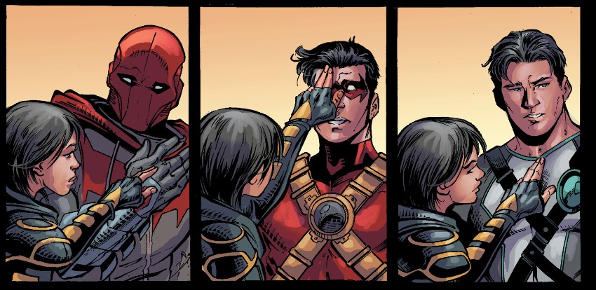
This is a comic that works best if you switch your brain off, and probably also if you don’t have a fully understanding–or caring–of how the timeline for New 52 Batman can possibly make sense. I don’t really know how tight Jason Todd was with Tim Drake or Dick Grayson, or if their relationship as depicted here squares with what’s been shown in other books, and I don’t much care. I know exactly enough to enjoy it–“hey, I read about each of these dudes as Robin!”–but not enough to think too hard about it. They each fit a clear, archetypal team-up partner role (which Cassandra makes hilariously overt and on-the-nose, below); they’re different enough to make the banter enjoyable; and that’s about all that matters to me.
The art is also fascinating, because it’s by Paul Pelletier, whom I generally consider a solid, reliable, unflashy artist who does work in a diluted Alan Davis mold, but either he’s changed up his style or the inkers are going at it hard, because it’s very much in line with Tony Daniels’ work in the first issue. I enjoy the tension there, not to mention the more solid underpinnings that Pelletier brings to the style than Daniels does, but I can’t imagine it’s going to sway many people who were on the fence.
Issue #3 is the first one where I found myself thinking “okay, time to get on with it,” but if they do in fact pick up the pace in issue #4, I think I’ll still be onboard. This is enjoyable, dumb fun.
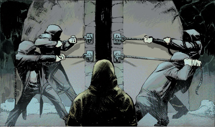
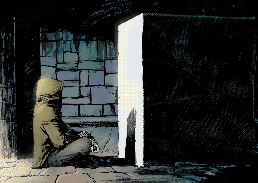
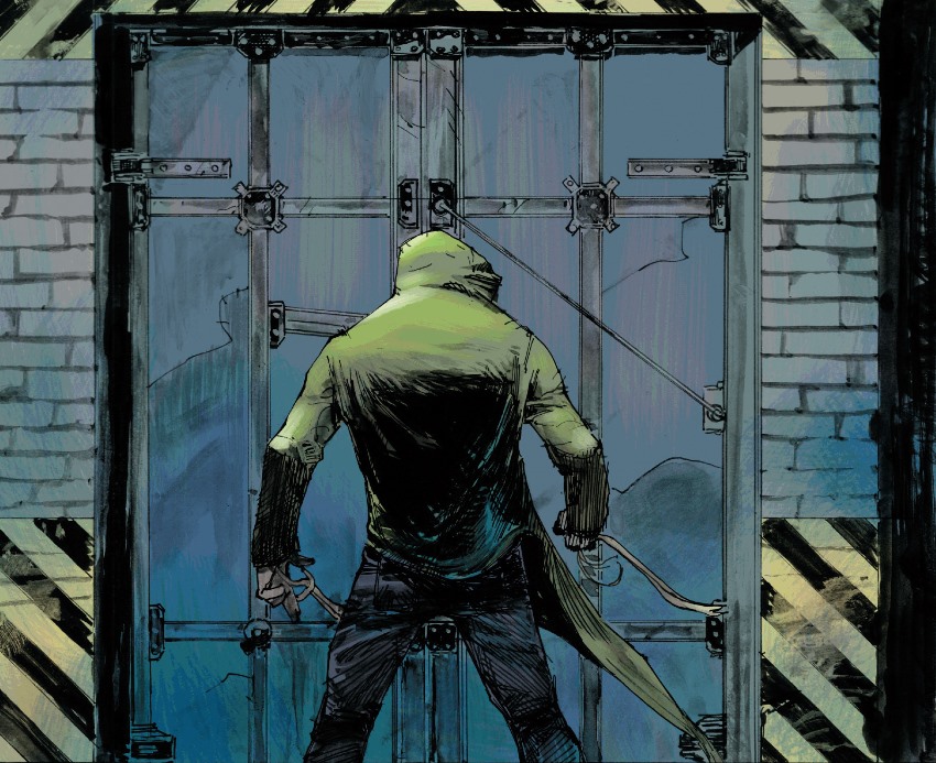
With Karnak #1 at Marvel, on the other hand, I found myself thinking “time to get on with it” around page 5. Page 1 is a lovely full-page establishing shot of a building; page 2 is three panels of a door opening and one line of dialogue summoning the main character; page 3 is one panel of a different door opening, one panel of a phone ringing, and one panel of the main character answering the phone, and page four is the title-credits page. As pre-title sequences go, this is not exactly Goldfinger. Then, on page 5, the main character walks out of a door in three silent panels.
It’s very slow, and very old-school “decompressed”, and in many ways it is also very late-period Warren Ellis.
This makes me sad, because for as long as I have enjoyed Ellis’s work (about two decades now), I have always (somewhat embarrassingly) enjoyed his superhero work more than his creator-owned stuff.
I think there’s something about functioning with the restrictions of someone’s else’s universe and utilizing someone else’s characters that forces Ellis to keep his most Ellis-y tics somewhat in check. Or, more accurately, maybe I’d just rather see him put (say) Excalibur through the standard Ellis paces (bar! weird demon thingy! futurist concept! bar again!) than see him put Ellis characters through those same paces, where they seem more at home.
But with this book, Ellis continues the trend of his Moon Knight work, where he pretty much just writes his main character as a stock Ellis character. Karnak has n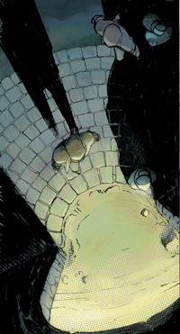 ever been the cheeriest Inhuman, but he achieves new levels of snark and surliness here.
Also (and again somewhat directly counter to B&RE), I found it impossible to ignore how clunkily this seemed to fit in with the primary Inhuman series, which I’ve just been reading. Between the special-to-Ellis mixed-case lettering, the appearances from Phil Coulson and Gemma Simmons (whom I still think of as Marvel TV universe characters), and the generally off vibe from Karnak himself, this just didn’t seem like a book that was particularly interested in engaging with the universe on the same terms as its parent title.
(Although I could very well be wrong on this. I’ve been reading Inhuman on Unlimited, and there may very well be shifts in that six-month Unlimited/real-time gap that bring these two directly in line. Feel free to shout at me in the comments!)
The art, from Gerardo Zaffino, is gorgeous — just different enough from mainstream Marvel style to keep it interesting, and clear and effective in depicting action and settings. There are elements of his late father Jorge’s work in here, but it’s very much it’s own thing, and I wish I enjoyed the story enough to keep me reading to appreciate the art. Maybe once it shows up on Unlimited–and by then I’ll be caught up with Inhuman, so maybe I’ll get whatever references I’m missing.
