You know, I totally volunteered to write this first post since I was completely unsure if I was going to have my act together enough next week, and there were some holes in this week’s schedule where I was, like, “Yeah, I can do that, I think? Plus, you know, it’ll give me a chance to get a post in before Graeme raises the damn bar…”
But the idea of writing something that can really measure up to the importance of the first post on a site that is being underwritten by dozens of people who support the podcast and (I hope) our plans for this website has been a bit hobbling. It’s like I volunteered to put my foot into the bear trap first? (And keep in mind here the bear trap represents my own worries about perfection and import and all that other crap that somehow seems paradoxical stemming as it does from a lover of a disposable pop medium. I don’t want you to infer I’m talking smack about the support we’ve received. Far from it, I’m talking smack about the inside of my own head.)
All of which is to say: ignore that stump where my foot used to be! Join me behind the jump, and let’s talk comics!
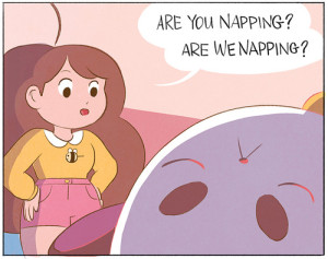
Bee & Puppycat #1: I was keen to pick this up considering how much I enjoyed the two episodes of the animated show I’ve seen over on the ‘Tube. I’m loathe to explain the high concept — unemployed twenty-something adopts a magical alien puppycat that fell from the sky and is thus able to eke out a living by doing magical alien temp work — because, I dunno, Star Wars: A New Hope isn’t really about the high concept either (despite what Joseph Campbell and George Lucas would have you think). Bee & Puppycat is all about the details, whether that’s how well-synced the concept of magical alien temp work is with our current “What, Me Worry About Joblessness?” situation here in the U.S., or how the character designs, backgrounds, and uses of color (in addition to the actual animation itself in the show) are all so impeccably done.
And sort of in the same way that I so appreciate Tina Fey for making Liz Lemon a comedic woman-child that can horn in on the Judd Apatow comedic man-child action while not just being a male character in drag, I like how Natasha Allegri has made Bee an underachiever and a slacker with specific tics and frustrations that sidestep the usual easy signifiers (apart from a Liz Lemonish craving for bad food that, let’s face it, can safely be acknowledged as a near-universal human trait, right? Maybe it’s just the circles I run in but I’ve met very few people for whom bad food held no allure…and those were people for whom food held no allure, basically).
But, as lovely-looking as the comic is and as glad as I was to get it, Bee and Puppycat #1 also embraced all the things that kind of bugged me in the animation — namely, getting laughs from the juxtaposition between the careful presentation and the slapdashedness of the giddy hijinks. I know, I know, this is a manga and anime staple. But I feel like the switch in styles there is used not just for laughs but also as a way to convey the discomfort or surprise of the characters — making the viewer suddenly aware of the medium in a way that matches the character’s own surprised self-consciousness. At a few points in Bee & Puppycat (the show), I felt like I was watching Hayao Miyazaki’s Family Guy, and while there are some people for whom that is exactly and precisely what they want out of life, I’m not one of them.
The comic is far gentler with that kind of thing — the main story drawn, co-written, and co-colored by Allegri is basically just set-up and a juxtaposition of two types of dreams: the magical, semi-lyrical dream of floating keys and Puppycats to be unlocked, and the nightmarish “I’m outside in public in my pajamas” anxiety dream — and yet, it had me surprisingly skittish in a “once bitten, twice shy” kind of way. I enjoyed the second story — by Madéline Flores, which promises to be a sequel to the first storyline of the show — much more. It could be because of something as trivial as more detailed backgrounds? That seems like a silly reason to pick one story over another, doesn’t it?
As a result, part of me worries the stuff I like about Bee and Puppycat are precisely the things nobody cares much about, and the stuff I don’t like is why the Bee & Puppycat Kickstarter made close to a million dollars? And yet, I’m not too worried. It’s not like Bee & Puppycat, either the show or the comic, is hurting for enthusiastic fans, and it’s not like I’m hurting for comics to read. In fact, as a dude in my late forties, the world is pretty much my oyster — they play Squeeze songs in supermarkets, for Christ’s sake! — but I think I’ll probably keep an eye on the next issue or two anyway to see if I either get more comfortable with things as they are, or if things change up.
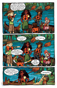
Lumberjanes #1 and 2: It’s an easy leap from Bee & Puppycat to Lumberjanes: they’re both published by Boom!, have female leads, and possess really compelling art. Part of what dragged me back for issue #2 was Brooke Allen’s artwork that straddles a line between super-loose and overworked: each of the main characters have distinctive features that belie a number of influences (my favorite character to look at is April, a bold, detail-obsessed overachiever type whose wide eyes and tiny hands give her the expressiveness of a Kate Beaton sketch) but they’re all unified with a heavy marker-looking silhouette line that also helps them stand out against some really heavy background colors. I also dig how the inside of each cover presents the badges the Lumberjanes will collect in the course of an issue. Designed by Kate Leth, the badges are whimsical and fun but, presented without descriptors when you first encounter them, also possess a certain air of mystery…which perfectly encapsulates the tone Lumberjanes is trying for.
And I admit it, I also picked up Lumberjanes because I’m fascinated in the distance between what the book is trying for and what it’s actually accomplishing: to put it bluntly, the book feels like the work of new talents, barely able to hold together everything that they’ve got going on here. Everything feels over-developed and under-explained, everyone caught in mid-best friend relationship, and at times I wished for a little less mix-tape track lists on the back page and cut-away Lumberjanes manuals on the inside cover and, you know, just a damn roster of everyone’s names. (No idea what the tall one’s name is, for example, even after some ardent — although admittedly disorganized — flipping through of issue #2.) The material works so hard to never seem less than professional that it feels a touch claustrophobic, like it needs to open up and breathe.
And this is actually a pretty good lesson for me as well, which is probably why I’ll be back for issue #3″ There are a lot of new creators popping up in the industry these days and I think it’s worth it to be patient and see how they develop.
Shutter #2: Again, another good example of what I’m going on about: comparatively, Joe Keatinge has got a lot of experience under his belt now in terms of number of issues written, but Shutter barely nudges into the realm of intermediate work. Undoubtedly, part of that can be attributed to Leila del Duca, a really strong artist who is nevertheless new to the world of full-fledged ongoing comic books, but part of it has to be laid at the feet of Mr. K. as well: an early action scene with the protagonist abducted via a man’s giant chicken and his retinue of rodent servants piles on flying saucer police, leonine gangsters in a flying roadsters, and ghostly, clucking henchmen, with the action building to a dramatic leap to freedom by our heroine. But because Keatinge has all the dials cranked to eleven, and because I suspect del Duca tried to dutifully get everything in there rather than making some tough decisions about what to cut, that dramatic leap carried no punch whatsoever, even as a full page splash.
It’s vexing but, if you think about it, not surprising. I’m incredibly glad that Image is getting new talent out there instead of just providing shelter for Marvel and DC names hoping to earn some indie bread, so I actually need to remember that neophyte mistakes like that are a good sign, not a bad one. Unfortunately, it’s important for me to remember since every time the thick tread of the hype juggernauts roll over my social media I tend to counterbalance with a lot of (by which I mean, probably too much) invective. It’s an interesting time for the industry, to put it mildly, and Shutter is an interesting book both in what it tries to do and what it fails to do. Currently, I’m more enamored of what the book could be than what it is, but due to where I’m at and where the industry is at, that probably describes a significant chunk of the American comic book market for me these days.
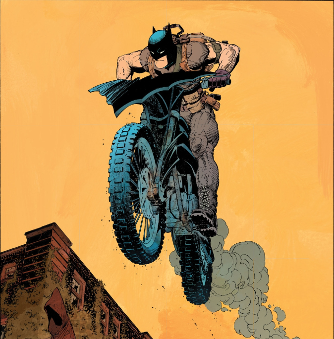
Batman #31: Jesus, I love that full page splash of Batman jumping into the Riddler’s arena on his bat-dirtbike. I fucking love the shit out of that page. (Huge props to colorist FCO Plasencia for nailing that yellow background. Such a perfect mix of pop energy and dyspeptic dystopian grunginess.) If designers aren’t ripping that image off for the rock show posters in five years, western civilization should just pack it in. And the fact that this is a scene that Snyder & Capullo teased back in issue #21 or whatever…say what you will about Snyder (and I admit to being all over the map with his handling of Zero Year — it’s basically the Girl Talk album of Batman origin stories: canny reconfiguring, shameless Greatest Hits pandering, a lot of giddily mindless jumping around), but the guy knows how to write Batman staff I feel like Capullo wants to draw, as opposed to all the dudes on McFarlane’s Spawn, who seemed to specialize in coming up with stuff nobody wanted to draw. Even when Snyder cranks up the stakes so high you get “this is the deadliest physics lecture Bruce Wayne has ever faced!” scenes, it still keeps me eager for more.
In fact, I know this is a common bleat from the Jeff Goat, but boy is it great reading Batman comics without having to worry about the rest of New 52 continuity. Although I was late coming to it, I’ve picked up a lot of appreciation for Silver Age DC’s various attempts to give you the one Superman or Batman story you wanted to read without having to worry about the rest of it. Admittedly, they didn’t do in in an especially subtle fashion (imaginary stories, parallel earths, dreams, hoaxes, fevers) but, you know, you got what you wanted. When Zero Year comes to an end, I’ll have to go back to the world of “The Joker farts, and nine other titles have to smell it.” And it’s not like I don’t appreciate the Batman Family concept — there’s a lot of things I really, really like about it, not least of all a female fanbase that continues to remain dynamic and engaged despite being periodically treated by DC Editorial like they’re kudzu in need of clear-cutting — but having Batman the lone avenger (a perfectly valid take) also be Batman, the enabler and networker of his own “family” (again, perfectly valid) means that we keep having to get “Batman, the bad dad” stories where he’s somehow always justifying his shitty treatment of colleagues and wards as attempts to protect them (while also, you know, constantly sending them out to battle and putting them in danger). There’s less cognitive dissonance for me now in trying to accept both simultaneously than being able to pretend the other doesn’t exist in the same time and place.
Anyway, it’s been a treat, is what I’m saying. Unless things totally get borked in the end, I think I’m going to end up really happy overall with how Snyder and Capullo and team have handled this.
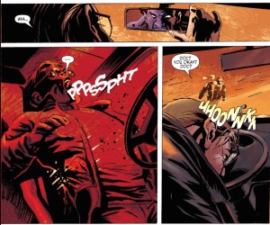
Wolverine Chop Shop #1: Came across this in Marvel Unlimited while perusing creators — the prospect of seeing Tomer Hanuka draw Wolverine was too good to pass up, but of course, he just does the cover, leaving this 2009 one-shot of Logan getting his organs yoinked to writer Mike Benson and artist Roland Boschi.
The story itself is of interest to the extent that Benson knows enough about Logan (he’s got claws, he’s got a healing factor) that he handles him some of the details differently from a generic hard-boiled hero, but I half-suspect he either didn’t know or didn’t care enough about Wolverine to really think it out very much. “You might not believe it, but it ain’t every day something like that happens to me,” Logan narrates as he gets it on with the beautiful woman who’s been luring men to their organ-explanted doom, and it’s tough to tell if Benson actually knows he’s telling one of the biggest lies in comics. In fact,there’s a weird angle going on in the book that is maybe the result of some hasty, ill-conceived rewriting: on the one hand, Logan very deliberately goes on to seek revenge against Annabel, the woman who sets him up, telling us “I considered doin’ what she’d done to me, but it woulda been too easy to end it like that,” suggesting he took her seduction and betrayal personally, but on the other hand, we get a whole page telling us how he’d heard about the organ harvesters and “so I used myself as bait and ended up here […]”
So we have a choice: did some hasty rewriting change Logan from unwitting victim caught in spectacular coincidence to avenging hero who deliberately put himself in harm’s way? Or is Logan supposed to come off as the kind of guy who is going to let himself get seduced unnecessarily, operated on unnecessarily, left for dead unnecessarily, just so he can go back and kill everyone involved while talking about it like he himself had been personally wronged? I worry that it’s the latter: male adventure fiction has to weave male fantasies of power and powerlessness simultaneously and I think here we have a case where it has been done with any particular effectiveness. What is effective are the scenes where Logan takes his revenge: they have no dramatic tension to them in any way but at least there’s a certain elegance in the execution.
Oh, but so the real point of writing this is after my moaning above about wanting a certain freedom from continuity with Batman, I do find it’s interesting that through a weird confluence of events, we can have exactly that with Wolverine and it’s that series of events I’m thinking I’d like to return in a later post: let’s just say that, if nothing else, Marvel owes a huge debt of gratitude to Dave Cockrum for making Logan –Wolverine out of costume — so idiosyncratic and compelling. The vast majority of superhero alter egos are visually bland (Steve Rogers and Hank Pym and Clint Barton…how really can you tell one from the other visually?). But Logan is Logan, and you can have a comic where Wolverine never gets into costume once and not feel cheated…as long as you don’t pay attention to the story, anyway.
Oh, and but the other point of this is indeed the charms of Marvel Unlimited, which allow for a kind of browsing and discovery I really don’t get with purchased digital comics. Having Marvel Unlimited reminds me of when I was young and had other friends who had read comics, and the pleasure of going over to their house and perusing their collection. Flipping through the books, you could begin to guess at the other person’s preferences, their obsessions, while also leaving you room to wonder about where your friend’s head was at: why did they have these seemingly nonsensical holes in their collection, or these oddball purchases of books that seemed so charmless as to suggest blindfolded shopping?
Wolverine Chop Shop is not a chance encounter with a hidden gem (that for me is still the four or five delightful issues of Young Men squirreled away in the back of MU’s alphabet), but, considering it really didn’t cost me much more than the time to read it, it was a fun way to wonder where Marvel Unlimited’s head is at. I’d be lying if I said that didn’t have a certain value or charm all its own.

Woah, Jeff writes! And it’s not show notes!
I agree with your words on Bee & Puppycat… or the animation at least, since I didn’t read the comic. I think, like in the animation, the tics of the comic that make the reader/protagonist conscious of the medium will become comforting the more you read. I thought Regular Show filled all the mundane slackerisms injected with surreal adventure I needed until I saw the Bee & Puppycat shorts. B&PC speaks to loneliness in a way RS doesn’t, and then lifts both Bee and the viewer out of it. This is something that probably necessitates the reader/viewer putting themselves both in the comic and inside their own headspace as they read/view. I am interested in the treatment that the comic gets from other creators given how new the whole thing is, so I’ll have to try it out.
Glad you followed up on Shutter. Shutter is weird, isn’t it? Is that the point? In my opinion Leila del Duca is doing everything right, and it’s beautiful. I don’t know how she could affect pacing while Keatinge has everything cranked up to 11 as you put it. The insane pace in #2 makes the enjoyable cinematic prologue in issue #1 seem even more out of place, and yet I don’t think that the flashbacks are doing much for the story. Issue #2 also seemed kinda like a rerun. With this title there’s so little story it feels like entire issues could be chapters in DHP, but there’s so much art it feels like it could be collected in trade by now. Like I said, weird. At this point might as well wait for that cheap Image trade?
Good stuff, congrats on the Patreon, the site, and all ten other platforms you guys launched. Good luck!
Hello Jeff, and nice one on the first post. Great line about the farting Batman titles, and I’m glad you complimented FCO Plascencia, whose work puts a lie to the nation that Batman comics have to be dripping in gloomy tones.
These reviews are great. They read more like an essay than a series of capsule summaries.
Thanks, Nate! There were some points about continuity floating around in the back of my head I never pulled together for the reviews, so there was indeed the lightest dash of thematic consistency there — glad you noticed and appreciated! We’ll see if that happens more consistently going forward or not…I do hope so.
Thanks, Martin! That’s a good point about FCO Plasencia: the work manages to be unsettling with a much brighter palette. Everyone on the title is working a little bit askew, now that I think of it, and the work is clearly all the better for it.
Yellow? Unless it’s scanned poorly, I’d read that background as orange, so part of the power of the image comes from blue and orange being complementary colours. Of course, disagreeing about colours can be endless…is there an International Convention on Colour which designates the frequency of light where green ends and blue begins? Anyway, I’m all for harmoney on Flo P is great.