I keep trying to write a review of The Surface #1, the first issue of the new Ales Kot/Langdon Foss/Jordie Bellaire/Clayton Cowles/Tom Muller series that is released tomorrow, but every single time I start, my brain jams. Part of me wants to blame it on events outwith my control and Wait, What?‘s purview, but it’s the comic itself; there’s so much to unpack and talk about that I find myself stuttering and starting over, second-guessing myself: Shouldn’t I concentrate on this? What about this? Isn’t that even more important? and so on, and so on. Let’s pick things apart and leave them in pieces, instead, shall we? (I’ll do so under the jump, however; you should probably scroll down the listen to the latest episode, if you haven’t already.)
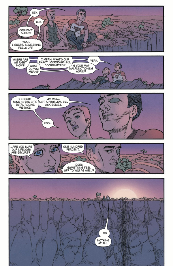
1. I listed everyone involved in the book above, instead of just the writer and artist — or, as I often do and shouldn’t, just the writer — because more than anything else, even Kot, Bellaire and Muller’s Zero — this is something that feels like a group effort, something in which every single person brings something that strongly contributes to the whole. It was actually Clayton Cowles’ letters that I noticed first, as odd as that might sound; the different fonts for different purposes, the different voices that each have. A serif font for something the first voice of the issue, asking questions and (for now) removed from the action on the page, contrasting with the sans serif, almost art-deco mechanical authorial narration of the main sequences featuring Mark, Nasia and Gomez, contrasting with the more organic, more traditional look in the word balloons. All three working together, while quite distinct.
And then there’re the colors, which are — as I think everyone has come to expect from Bellaire — just wonderful, attractive and as controlling of the reader’s experience as the line work on the page, or Kot’s script. The opening four pages have such wonderful, striking colors that it’s almost overwhelming; the blues, the greens and the pinks that pull your attention across the page in three pages of comic strip before coming together in an unexpected way in a page of graphics presumably by Muller. (The use of negative space and typography in the third and fourth page, too, comic strip and, what, “magazine design,” say?, mirroring each other in this great way.)
The designed pieces throughout the issue, speaking as much to information design on mobile devices as anything else — “swipe right to continue reading,” at the bottom of the page, emphasizing that — feel necessary to the pacing and the overall atmosphere of the issue, as well. Everything is almost the world we know, these fragmented moments of information and broken experiences that we’re trying to piece together into some kind of coherent whole. Or maybe that’s just me.
2. I didn’t say anything about Foss’ art, did I? It’s glorious, reminiscent of Moebius and Chris Sprouse at the same time for me, with elements of Geof Darrow in there as well. Maybe some Seth Fisher as well? (So busy, in places, so in control of the emptiness in others!) It’s cartoony and organic in this very human way, which I appreciated; I struggle with working out whatever Kot’s trying to do — the story he’s trying to tell, and what he’s trying to talk about — but this is what makes Foss’ art, and indeed the overall beauty of the issue overall, so necessary and sneaky. You read on, even if you’re confused, lulled into a sense of openness that a less attractive book wouldn’t be able to manage.
3. Foss’ art is maybe most appropriate in the scene with Jeffrey Loki, where it almost seems… too cartoony, perhaps? That’s not the right way of putting it, but there’s something about the incongruity of the style you’d expect for a scene like that and what Foss is delivering that makes it have far more impact. The emotional beats hit harder, in part because what happens feels more unexpected, emphasizing things in a different way than what the reader has come to expect. (Or, at least, what I’ve come to expect from such things; it’s worth noting that it’s also the most Zero-esque scene in the book, and a reminder that Kot has a particular interest in dealing with the threat of violence as a presence far more than he does actual violence. The feeling of vertigo when you think things are going to go wrong feels like something that he wants to explore.)
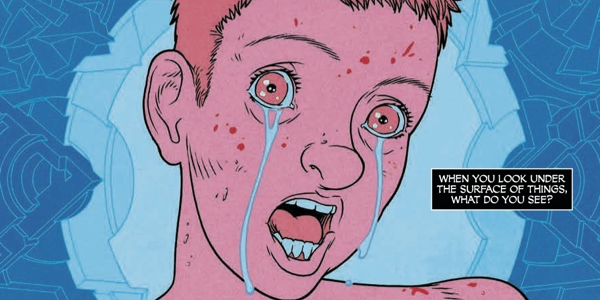
4 I have to wonder if I’m imagining the phallic and ionic symbolism on the first page or if it’s meant to be there. I wouldn’t be surprised if it’s all intentional, the book’s filled with that kind of thing (The eye symbolism in the tent scene, I absolutely love). Also, if it is intentional, then what to make of the form on the second page?
5. Not for the first time, there’s a massive Morrison influence to be felt in the writing, and specifically, a massive Invisibles influence (How could that not be the case, with dialogue like “the holographic universe theory isn’t just make-believe”?). It feels… younger, however, and more attainable than that series ever did, and I say that as someone who was young and Britpop-centric in the 1990s as Invisibles was coming out, going through personal dramas that had me wondering about how real the insect royalty of the outer church could actually be. Kot as modern-day Morrison is something I keep coming back to as I read his work, which amuses me considering how much I hated Wild Children for its closeness to GMo’s work at the time; The Surface reminds me of Change, the Kot book that completely turned me around on him, but I’m not entirely sure why. With no real evidence, I feel as if it’s another time where he’s trying to translate an emotional experience into narrative and make the personal universal.
Like Change, I feel like there’s a kindness and curiosity present in The Surface, which almost certainly means that this’ll turn out to be meaner than I expect further down the line. Cynical, me?
6. It’s a dense first issue, but a fun one. The messages quasi-hidden on the design pages (“Nasia are you seeing this”), or Kot’s meta-commentary in what used to be editorial captions (“* Believe it or not, this is also a clue” runs one footnote) are playful in format and occasionally in tone. Having some of the text pages part of an in-universe article with the title “Elusive Writer Maintains ‘It All Makes Sense At The End. Maybe,'” with the writer “Doublehead” clearly a stand-in for — or, at least, allusion to — Kot himself adds to the whole thing, as well, bringing another layer of reality to something that’s already working in at least a couple of different places. (And looking at those pages again now, seeing “Doublehead” cite Change in particular in connection with his new project, makes me wonder if I came up with the Change connection myself of subconsciously took it on after reading these. Comics Inception!)
7. Also to be found in the issue: “Feed 7: Obligatory comics reference to show the author’s understanding of the art form’s history” and “Feed 857: With the words ‘Spider Jerusalem was here’ written all over his face.” I see you, Ales. On the same page, and not to be ignored, however, are references to marrying dogs being within rights as long as its consensual and Saudi Arabia turning someone gay. Given that the majority of the issue focuses on a triad of Mark, Gomez and Nasia, I’m unsure if those comments are just play or something that we’re supposed to notice for later. (I actually love how understated the polyamory of Mark and lovers is in this issue; there’s no oh look at us, we’re so daring on behalf of either characters or creators, it’s just what’s happening. I do worry that Nasia’s not okay with everything, mind you. I worry about such things.)
8. As I said, I’m scattered and uncertain about everything to do with this issue. Everything, that is, beyond the fact that I want to read what happens next; The Surface, like Ellis and Lotay’s Supreme: Blue Rose, feels like a queasy sci-fi that’s doing things I’m unsure about but feel necessary nonetheless. Is “Confusion Comics” a thing yet? Maybe it should be. If nothing else, it’d let me know when there are more things like that around that I want to find more of. All of which is to say: I really liked this. More, please.
9. Also, can we talk about how great the cover is? Because that’s just an amazing cover.


‘Confusion comics’ is an interesting idea. Im guessing that Nameless by Morrison and Burnham goes in that category too.
I havnt read Surface but I have read Nameless and Supreme Blue Rose and even if it is confusing it feels different to the confusion that was in Lost. Im sure someone cleverer than me would be able to point out the distinction.
This comment is a bit late, but I too enjoyed The Surface quite a bit. Kot is putting out fresh pop comics and he clearly cares a lot about what he is doing. Great stuff. Langdon Foss’ work is tremendous here, exploding with energy and verve.
On another note, this book holds the distinction of perhaps being the first comic ever (?) to have contact info for those who are interesting in purchasing “media rights” to the story, listing what one can only imagine are the names of the Hollywood agency and management company repping Ales and his work: WME and 3Arts, for those who want to send the boys a giant sack of cash for the rights to make a crappy movie outta this. Not sure how I feel about creators being that boldfaced with their intentions to “sell, sell, sell” their properties to Hollywood. It’s at least honest, I suppose, but also seems like it could be an ominous trend… Can we at least PRETEND these things are just supposed to be comics first?!!
How could that phallic/yonic imagery on the first page NOT be intentional – it’s about as subtle as a punch in the face (or the crotch).
Not feeling this one yet – the characters/plot have not grabbed me the way the art has. I’m generally interested in what Ales has to say – Zero is hands-down one of the best comics on the stands today and even Secret Avengers is a lot of goofy fun – but while his stuff is usually admirable, sometimes it speaks to me on a visceral level and sometimes it doesn’t. That may be my problem, not his, but doesn’t solve the conundrum of whether I want to see more of this book.