Kieron Gillen and Salvador Larroca have been part of Marvel’s Star Wars comics relaunch since the beginning, almost three years ago. They teamed together to deliver a strong 25 issue run on the initial Darth Vader series; Larroca moved to Star Wars immediately afterward, and Gillen now joins him as the flagship’s regular writer with Star Wars #38.
Given that pedigree—not to mention their previous comics work, and Gillen’s other huge Star Wars-related success with Doctor Aphra—it seemed like a safe creative team to follow on Jason Aaron’s opening 37-issue salvo.
For the most part, “The Ashes of Jedha, part I” succeeds. As the title suggests, this issue brings a number of elements from Rogue One into the series. It’s the sort of thing that only a large-scale serialized fiction can do, and it’s rare (and oddly exciting) to see it happen on this level and with this fractured of a chronology.
Here’s what I mean: the timeline of the Star Wars comics that have come out since 2015 falls after the first Star Wars movie, which was released in 1977, but before the next installment (1980). These issues, like all other Star Wars media, incorporate characters from the sequels (1980, 1983) as well as the prequels (1999, 2002, 2005), plus occasional additions from ancillary media like the Clone Wars and Rebels TV series, as well as their own expansions to the canon.
The sudden influx of Rogue One characters (speaking and background), along with settings and ideas, is fascinating, because Rogue One was set just before the events of the 1977 film, despite having been released just last year. So this series has to create the impression that none of these new-to-us bits of IP are in any way new to the original series’ characters; conversely, it braids the events of Rogue One even tighter into the Skywalker canon by retroactively assuring us that Luke and company had all dealt with the fallout from Rogue One.
I’m not quite sure why that feels so brain-bending to me—maybe just because it crosses the streams of major motion pictures released 40 years apart while also jumping an in-canon bridge between movies and comics—but it very much did. (It’s the nerdy secular version of, I dunno, if the writers of The Ten Commandments had had Charlton Heston’s Moses stop by Gesthemane while wandering in the desert, just to seed that easter egg (no pun intended) for the New Testament.)
Also, I absolutely loved Rogue One and everything it brought to the Star Wars universe, so that gives this incorporation some personal heft as well. And Gillen and Larroca (and the rest of the creative team) mostly deliver.
Even though I still tend to think of Gillen as a smaller-moment writer, excellent with relationships and subcultures and thematic resonance, he’s also become adept over the years at hitting the necessary beats of a blockbuster-ish piece of mainstream entertainment. This issues gives Luke a nice fist-pumping hero moment (lightsaber on a horsey-thing!), hits the necessary jeopardy/infodump/setup beats, introduces some intriguing supporting characters, and (unsurprisingly) nails the voices of the whole main cast. Gillen also gets to flex his old Journey of Mystery muscles and general gift for prog-rock mythologizing, only with a Star Wars-y twist.
(“A holy moon, maimed, dying. I call the fiery rain Jedha’s tears. I weep along with her,” says Chulco Gi, aspirant to the Disciples of the Whills (one of the dudes in the tall-headed red burqa-looking thing from Rogue One) in front of a carefully-rendered image of the shattered moon. It’s like a Muse song turned into a comic book page.)
I’m never clear how much input comes from the Lucasfilm Story Group folks (there’s three of them credited with the rest of the creative team), but this book also made me want to give specific kudos to editor Jordan White, who has done a remarkable job turning out a Star Wars line that’s consistently above-average, with coherent, consistent (but not overly same-y) tone and voice. It’s gotta be a near-impossible task, serving countless masters and a horde of rabid, nit-picky uber-fans, but White has done a hell of a job with it so far, and continues that trend as he clears the hurdle of the first major writer change on the flagship book.
My primary frustration, oddly, comes from the art.
I say oddly because I’ve liked Larroca in the past. He is, as I’ve mentioned before, part of the stable artists that I grew to love on late-90’s Flash stories. Larroca’s style has changed more than Carlos Pacheco’s or Humberto Ramos’ have—he used to be a more traditional, almost Ron Lim-ish superhero artist before making the turn toward heavier photo-reference—but in general he’s someone who turns out work that is at worst not-distracting, and that can be quite effective on the right book.
Even in this same universe, he’s done good work in the past. His Darth Vader run, in addition to being metronomically consistent, achieved everything it needed to effectively, if occasionally somewhat stiffly. And his previous Star Wars issues seemed like more of the same.
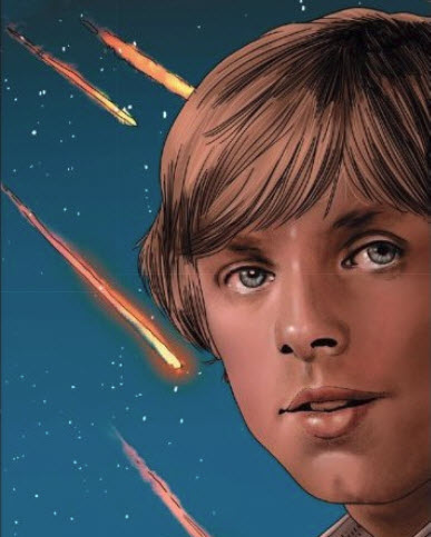
This issue, though, the photo reference seems to go to another level, to the point where on any number of panels it looks as though he’s doing fumetti and drawing directly on top of old stills of the actors.
Guru e-FX’s colors don’t help matters, either. Everything has a vaguely plasticky sheen, which is antithetical to the usual description of Star Wars as “lived-in”. Or, to use a more specific example, the iris of nearly every eye is colored straight into a near-photorealistic uncanny valley, which is distracting as hell.
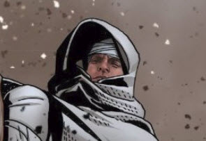
The drawing-on-a-photo effect is most pronounced when characters have their faces covered in any way. Luke in a hood looks like a bad Photoshop layer effect or a cut-and-paste gone wrong.
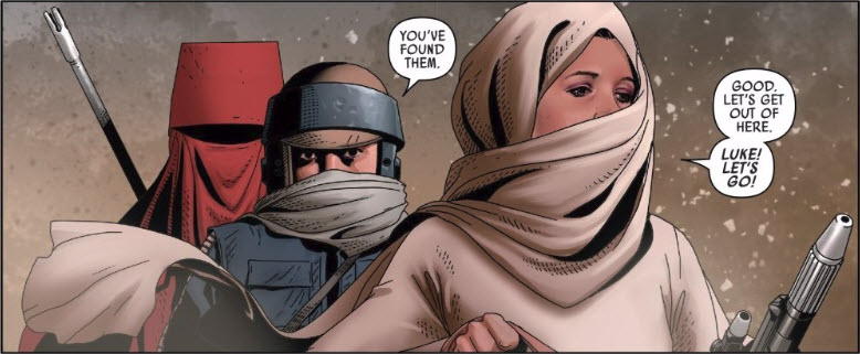
Ditto for Leia in a turban/face-scarf combo.
I have no doubt it’s an incredibly difficult line to walk, getting the likenesses close enough without too much stiffness or caricature. Rereading the 1980’s Marvel Star Wars books, I was amazed at how off so many of the characters look so much of the time. (And originally reading them as a kid, I hated that.) But the work here goes way too far, to the point where it’s actually distracting from the story. (The image of Luke in a hood is a relatively small portion of his triumphalist splash page. The weird face effect was pronounced enough that it distracted me on first readthrough from what should’ve been a cool storybeat.)
I don’t know what’s changed for Larroca—if this was an error in production somewhere along the way, or if it looks better somehow in print than on my digital edition—or if it’s not his fault at all, and the blame lies with the colorist or elsewhere. But I know for sure that this is something that they’ll need to address quickly, because all the cross-media novelties and talented scripters on the planet aren’t going to be able to overcome art that’s working this hard to distract me from them.


Larrocca’s been using photo reference for his humans since Newuniversal and it’s become offensively lazy.
Didn’t help that Sawyer from LOST was totally the wrong choice for Star Brand.